Independent project.
OUTLINE.
EXAM PAPER.
|

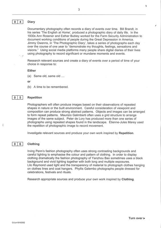
|
I have chosen the question of outline for my exam. For this project I have a few ideas so far. I prefer the idea of natural objects outlines because I find that the shapes and outlines are more interesting than man made objects which are quite limited and predictable. I want to start with simple images with different types of flowers with long stems so they're like Bill Beckley's work, I'll use plain white / black backgrounds to really show the outlines of the flowers and stems. Throughout the project I would also like to try a few images with people, their faces contoured and black lipstick that is done perfectly to really show the outline of the lips and the face, I think that this type of image would be effective. Once I have got an image for each of these I could edit them together so that the face is really strong with the flowers as a subtle background. Throughout the whole project I hope to collect images both man-made, natural and of people and find a nice way to use them together.
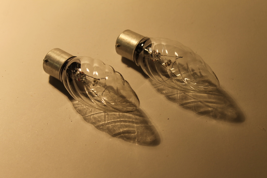
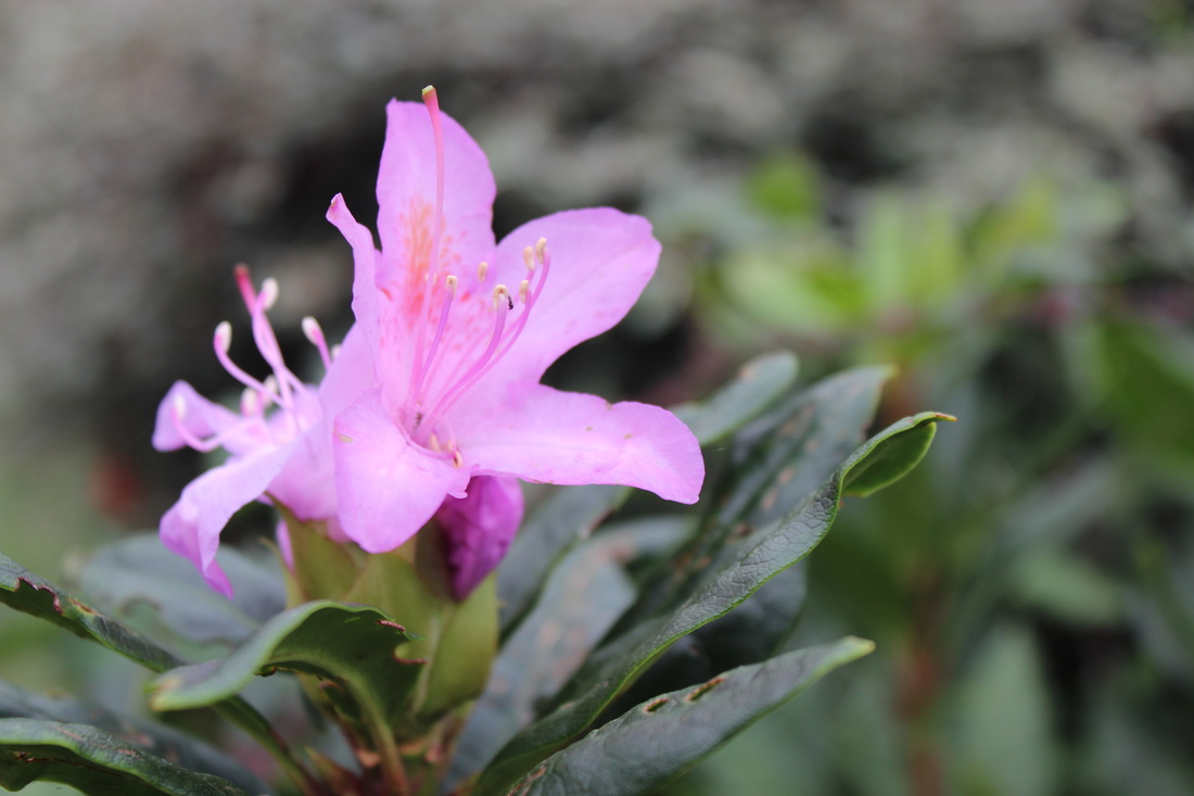
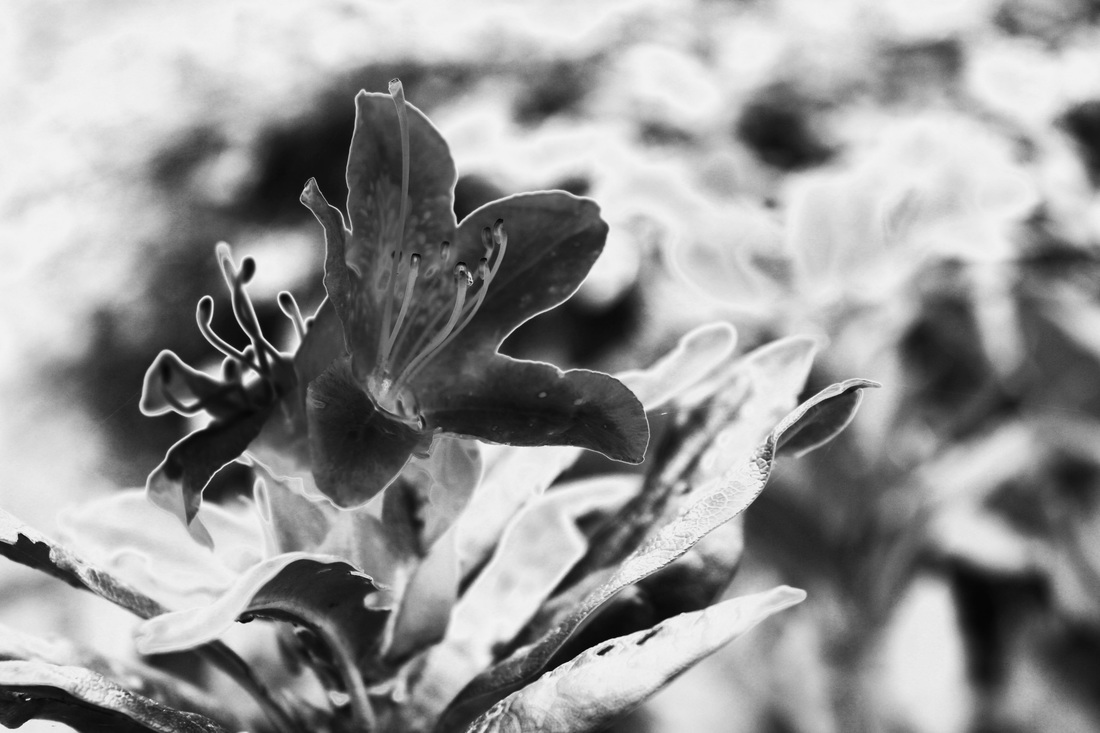
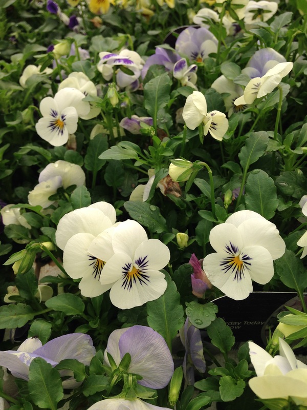
first photo shoot.


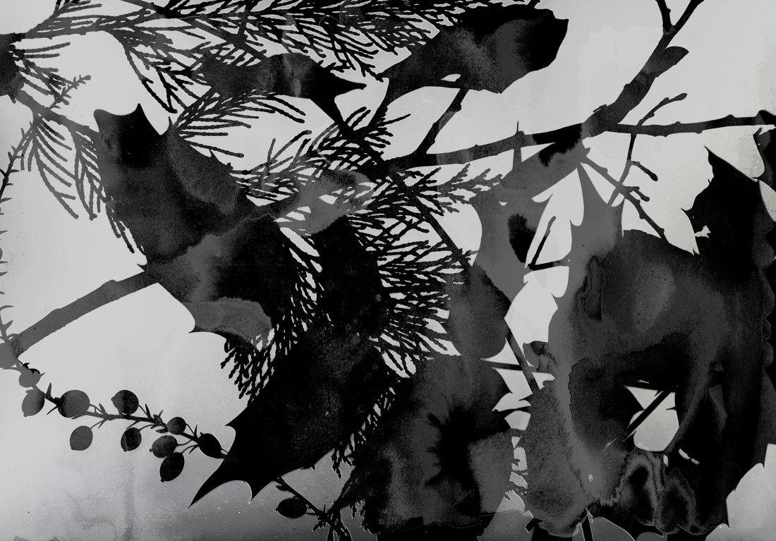
These images are my for my first photo shoot. I have started with the natural objects because they have interesting outlines that create nice shadows.
best 8 images.


I selected these 8 images as my best photos from this photoshoot.
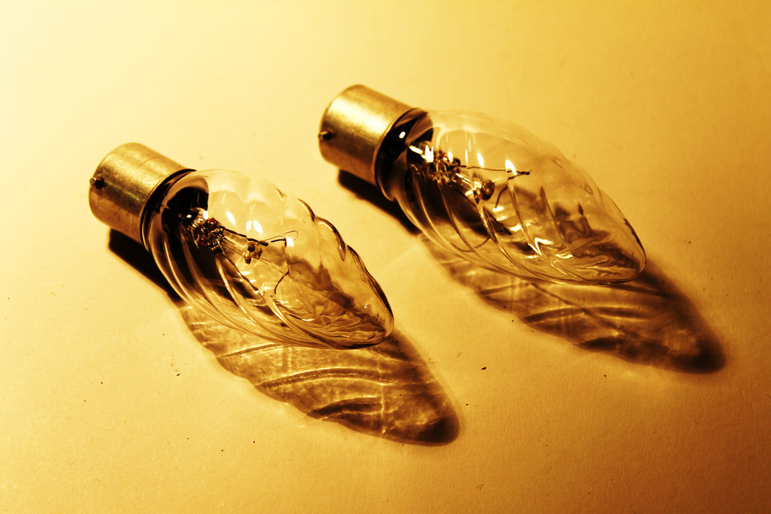
edited images.
|
|
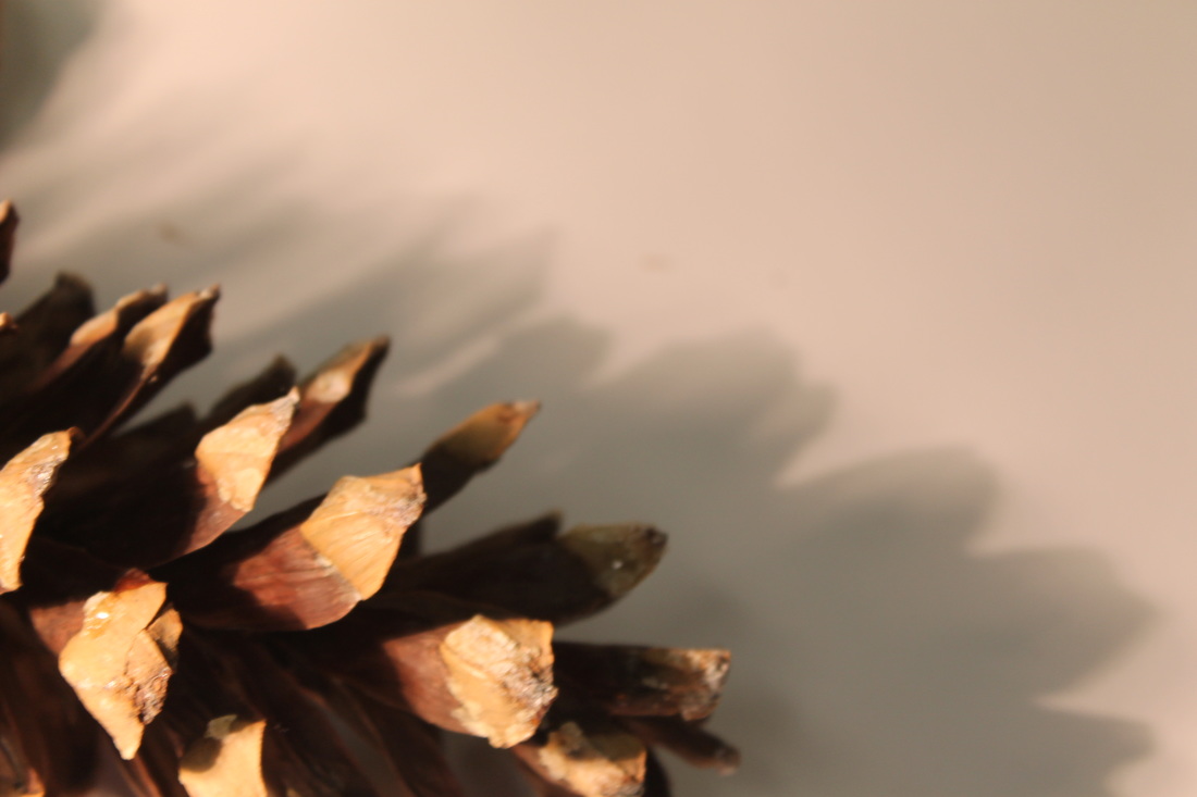
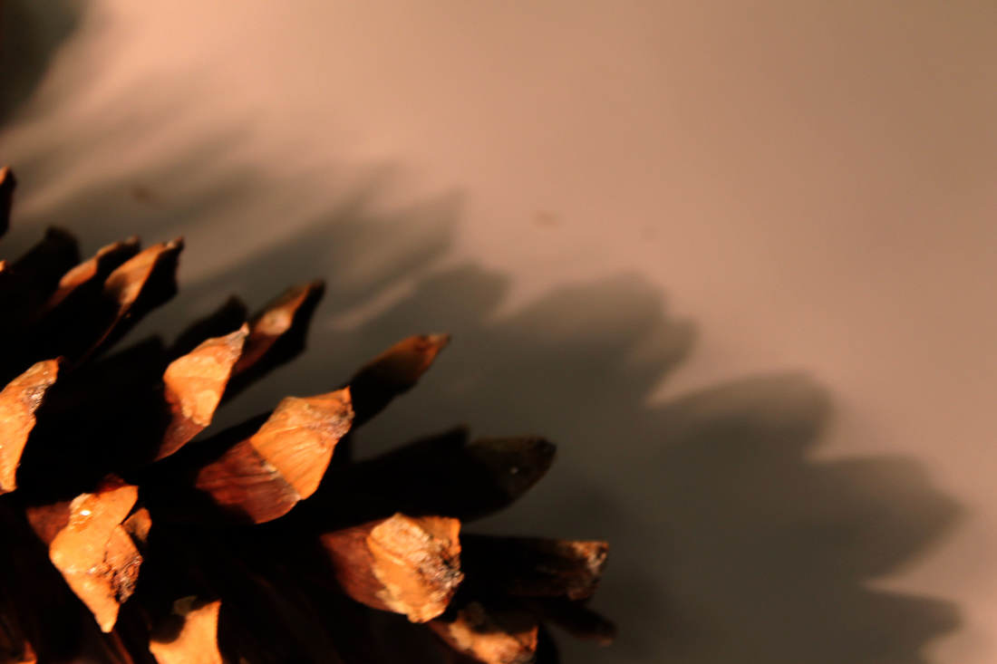
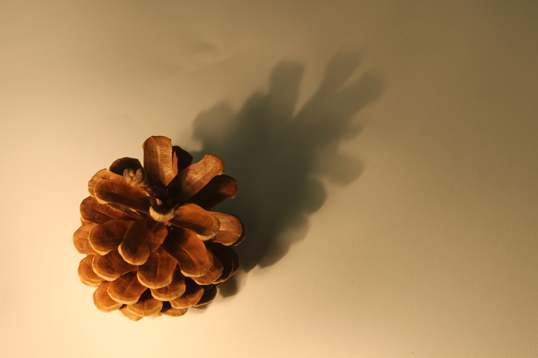
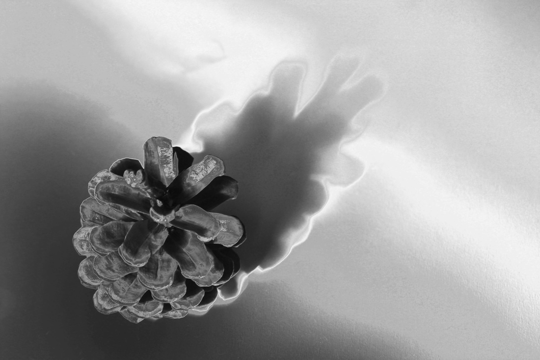
To create the image on the right I only adjusted the levels of the image, that created the really strong and defined outline of the shadow. It also made the roots of the pinecone really dark and the tops of it a nicer colour. By adjusting the levels the pinecones outline is very defined and strong.
|

|
To create this image on the right I adjusted the curves on the image, it made all the outlines more defined.
|
|
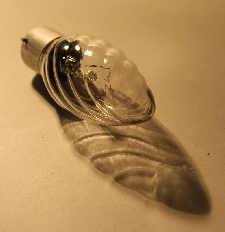
To create the image on the right I just adjusted the curves on the image which created the outlines of the shadows and the light bulb its self.
outlines in photograms


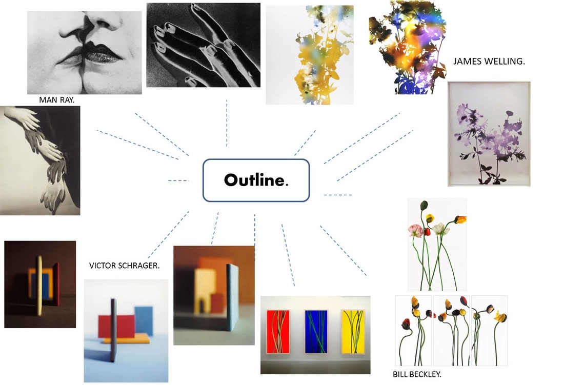
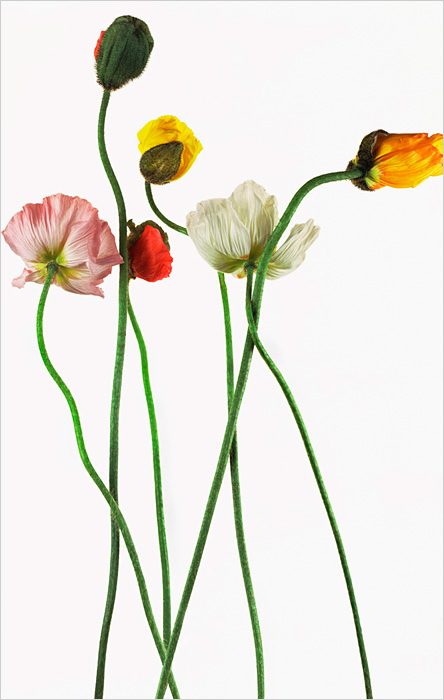
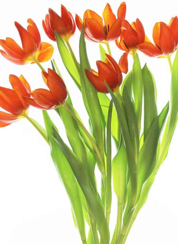
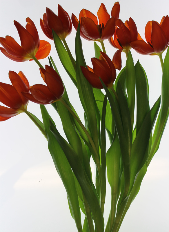
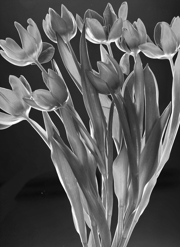
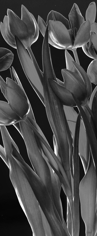
Bill Beckley.


Bill Beckley is an American artist / photographer born in 1946. He has several galleries across the world. Beckley focus on natural objects with long stems, usually flowers with a block colour as the background so that it doesn't take the focus away from the natural object. The objects are laid out in particular ways to show the
outlines and shapes of the flowers and stems.
I really like Bill Beckleys' work, especially the tulips on the white backgrounds. These images seem quite simple but the more you look into them the more depth they have, I really like the contrast in colours between the white plain background and the green and other colours of the flowers.
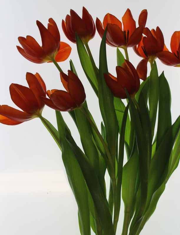
ANALYSIS OF PHOTO.
|
This is my favourite Bill Beckley image, I really like the simplicity of the photo. All the shapes and outlines are simple but interesting to look at.
The lighting of the image is really bright, the background is bright white which makes the simple and light colours of the flowers appear to be brighter. No area of the image is out of focus which is effective because it shows the whole outline, none of it is out of focus. I think that the stems are the most interesting part of the picture because they have the strong outlines and shapes, this is why its important that the whole image is in focus. The image doesn't seem to have much texture to it, the flower heads themselves do appear to have the texture. The petals look to have a smooth texture with a slight crease in them. The stems don't seem to have much texture shown through the image. |
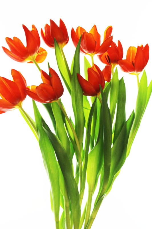
photo shoot in the style of bill Beckley.


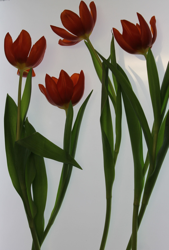


To create these images I used a light box and some tulips. I placed the tulips in specific places to create the images above. I think that the light box worked really well to create the images that look like Bill Beckleys work. the positioning of the tulips shows off the long stems and leaves to make the flowers look similar to Bill Beckleys images.

|
|
To create this image I firstly increased the brightness to the highest point to make the flowers really light and the leaves a brighter green. I also decreased the contrast to make the background really stand out.
|
|
To create this image I did the same process as the first edit. This image is much better edited because the original was very dark but with editing it looks much better.


These images are in the style of Bill Beckley but they aren't exactly the same. I like these ones because the tulips were a bit older and the petals were wilting so I could use the fallen petals for extra detail.
man ray.


Man Ray was an American artist who was also known for his photography. Ray spent most of his career in France. Man Ray usually took photos of body parts, normally close up to really define the outlines of the subject of the image.
I really like Man Rays' work, especially the images of the natural objects such as flowers, the solarised effect used on the images make them really interesting and add depth to the image. I would like to try working with both the flowers and the people. I find the hand images interesting as well because he has used different skin tones which shows a nice contrast.
I really like Man Rays' work, especially the images of the natural objects such as flowers, the solarised effect used on the images make them really interesting and add depth to the image. I would like to try working with both the flowers and the people. I find the hand images interesting as well because he has used different skin tones which shows a nice contrast.
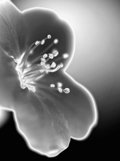
analysis of photo.
|
This is my favourite Man Ray image. I like the way that the stamens are in focus but the petals are out of focus. The black in the background really makes the petals outline stand out even though its out of focus. Towards the top of the image, the background gets much lighter as does the out line of the flower. Although the background gets lighter, the outline of the flower is still prominent. The centre of the flower is really light, as are where the pollen is collected, this shows a nice contrast to the stem of where the pollen is collected. Some of the pollen parts are really out of focus which contrasts well with the ones that are in focus.
The whole image seems very smooth, with not much texture. However the petal on the left that is in focus seems to have a slight furry texture to it. The flower fills the spaces really well, leaving a nice amount of space in the background empty. |
Man Ray photoshoot.


best four.


photos in the style of man ray.
This is the original image.
|
|
I tried to recreate the image above. I used a similar flower to the original image, I firstly found the filter Solarisation which created the out of focus background. The leaves round the back of the stem are also out of focus. Next I adjusted the saturation to the lowest so the image was black and white but I could still adjust other parts of the image. I then just adjusted the curves to create the nice contrast between the light background and leaves with the dark petals and under sides of the leaves.
|
|
This is an image of my own, on the left is the original image and on the right is the image after editing. Firstly I put the solarised filter on the image, it then decreased the saturation on the image to make the image black and white, this makes the image easier to continue editing, unlike the black and white filter which makes the image really difficult to continue editing. I then adjusted the curves to make the flowers really standout compared to the background which is black.
|
From the image above I then cropped it down further, I then increased the brightness slightly and adjusted the curves again to give a slightly different effect to the one above.
|
|
|
To create both images above I firstly put the solarised filter on the image, I then lowered the saturation to make it black and white. Next I adjusted the curves to make the outlines and shadows more defined.
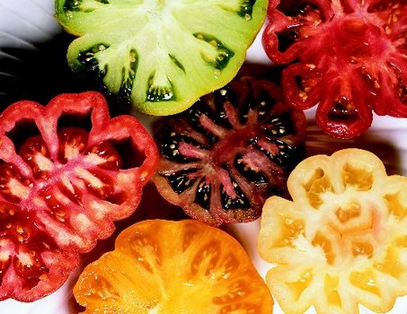
victor schrager.


Victor Schrager uses simple subjects which allows him to experiment with shape, colour, line, and the focus of the image. Schrager initially turned to still life as a way to sift different categories of image – an approach he describes as “composing with information.”
I like Victor Schragers' work mainly because of the simplicity of the images. He uses such small and everyday objects but the composition is so strategic that the images look mature and have more detail. I prefer the images using the fruit because they seem more realistic, I also like the colouring of the fruit, there are many simple colours but they work well together to create the strong images.
I like Victor Schragers' work mainly because of the simplicity of the images. He uses such small and everyday objects but the composition is so strategic that the images look mature and have more detail. I prefer the images using the fruit because they seem more realistic, I also like the colouring of the fruit, there are many simple colours but they work well together to create the strong images.
analysis of photo.
|
This is my favourite image of Victor Schragers'. The simplicity of just using fruit is really effective. The colours of the image all work together and none over-power any of the others.
The composition of the fruits work well with the outside fruits all overlapping the middle one slightly, it gives the idea of a large flower. Also the positioning of the fruit leaves a nice shadow round the edge of each shape. The lighting of this image also helps the shadows, the lighting makes the white background and the fruit its self stay bright and keep its strong, bold colouring. Not much of this image is out of focus, the background is slightly out of focus compared to the fruit. However the fruit its self is in focus. The image seems very textured, you can imagine the edge of the fruit being quite smooth and the inside being full of juice and slightly wet. |
my response to victor schrager.


To create these images I used some different coloured books and placed them in different compositions to create depth. I adjusted the focus quite a few times to try and just keep one book in focus and the rest slightly out of focus to create the effect that Victor Schrager does in his work.


I picked out the four best images from my response to Victor Schrager, I then cropped them down to the main focus of the image which was the books. Next I increased the brightness and contrast to create the images above.


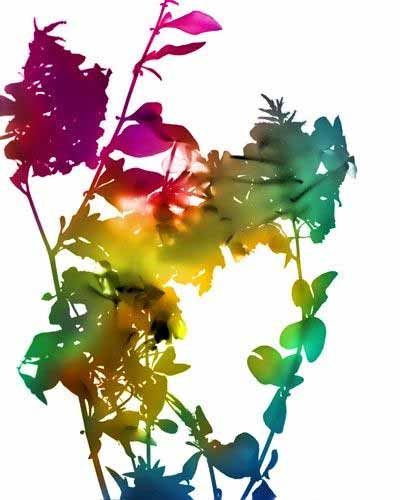
James WELLING.


Welling has experimented with different photographic mediums, including Polaroids, gelatin silver prints, photograms, and digital prints. The photos above are created by a photograms. Photograms are a type of image without using a camera or negative. A photogram is created by placing objects (flowers in Wellings' work) onto light sensitive materials then exposing it to light, a dark room is needed for this process.
I really like James Wellings' work, the colours used make the images really work. The natural objects used make the shapes of the image are really interesting, there is a lot to look at without being over the top or making it too much. The contrast between the colours used and the white background work nicely to create the perfect outlines of the flowers, stems and leaves.
I really like James Wellings' work, the colours used make the images really work. The natural objects used make the shapes of the image are really interesting, there is a lot to look at without being over the top or making it too much. The contrast between the colours used and the white background work nicely to create the perfect outlines of the flowers, stems and leaves.
|
This is my favourite James Welling image mainly because of the colouring, there seems to be a rainbow colour theme running through the flowers. Where the yellow is hitting the centre of the image it looks as though the sun is hitting the image directly in the middle which creates the more natural effect on the image.
The image doesn't seem to have much texture, it appears to be a flat and smooth image which helps to create the smooth outline of the image. All of the image is in focus as it wasn't taken by a camera so there are no out of focus parts to the image. |
my response to James WELLING.
backgrounds.


photoshoot.


my response to James Welling.


The images above I created some James Welling inspired work. Firstly I opened both the leaf image and the ink image in photoshop. I then on the leaf image I went to select, then colour range, I then clicked on the white of the image. Next I copied and pasted the background image across to the leaf image which created the images on the far left.
To create the images in the middle I increased the vibrancy.
To create the images on the right I then on top of the vibrancy I increased the saturation.
To create the images in the middle I increased the vibrancy.
To create the images on the right I then on top of the vibrancy I increased the saturation.
Development.
To create this image I used the same process as above.
(The first part.) |
I used the second part of the same process as before for this image. Increasing the vibrancy.
|
For this image I increased the saturation on top of the previous steps.
|
To create this image I then added the solarised effect. It created a completely different colour scheme.
|

|
|
For the image on the right I just decreased the saturation, then adjusted the curves.
I think that both the images above work as solarised images. By putting the image into black and white it combines Man Ray and James Wellings' work together.
I think that both the images above work as solarised images. By putting the image into black and white it combines Man Ray and James Wellings' work together.


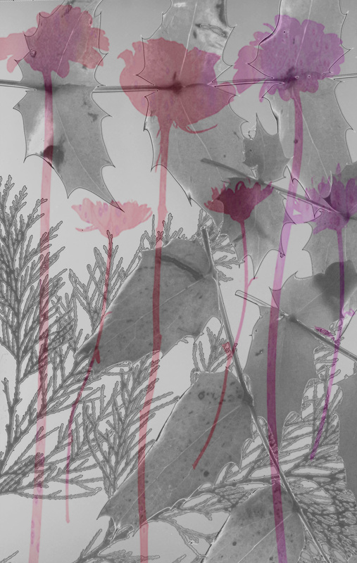
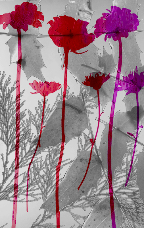
To create the image above I used the same process as usual however this time I used a different ink background. Once I had solarised it, the image colour looks like a UV light. By creating this image I have combined a Bill Beckley style image with a Man Ray solarised filter and the James Welling style of ink backgrounds.


This is another photo shoot of lilies to work with.
|
|


For the image on the left I put the solarised filter on the image, I then decreased the saturation to make the image black and white. Next I adjusted the curves to create the image above.
For the image on the right I used the same process to create all the James Welling inspired images.
For the image on the right I used the same process to create all the James Welling inspired images.


To create the image on the left I copied and pasted the James Welling inspired image on top of the solarised image. I then decreased the opacity to show some of the colour of the image and also some detail of the solarisation.
To develop this further I adjusted the Hue to change the colouring of the flowers.
I then changed the colouring again and then adjusted the curves which created the final image.
To develop this further I adjusted the Hue to change the colouring of the flowers.
I then changed the colouring again and then adjusted the curves which created the final image.


I repeated the same process as above with another image. This time the images have a slight 3D effect to them because the original image has a dark shadow around the shapes.


This is a new photo shoot that I can now work with.


developing my ideas.


To take this project further I decided to work with close ups of flowers as well as flowers with long stems.


To create the images above I firstly cropped the original picture down to size to focus on the single flower. I then put the solarised filter on the image which gave a nice colouring to the image. Next I decreased the saturation so it was black and white. After that I adjusted the curves to create the strong outlines of the petals and the centre of the flower.


(Top row.)
To create these images above I used the same process as usual by opening both the original image and the background, on the flower I used colour range to select the areas that I want to stay the same colour, so in this case black. I then copied and pasted that to create a new layer, then I selected all of the background image, copied it and pasted it onto the background layer then made it fit to scale. After that I adjusted the hue which changed the colour.
I really like the top row of images because you can see slight detail from the individual flowers and the petals are much more defined than previous images. I also like the effect they give with a black background instead of white. These images create a nice spin off of Wellings' work.
(Bottom row)
To create the bottom left image I used the top left image and solarised it, I then decreased the hue again to make it black and white. Next I put the solarised image on top of the coloured one and decreased the opacity, creating the second image on the bottom row. I then lowered the opacity again creating the third image and finally I adjusted the curves to create the last image. These images are a combination of James Welling and Man Rays work.


I used the same process to solarise these images as before, I think this image looks good solarised, it brings the real detail of the flower out, especially the darker lines on the petals.


To start with these images, I cropped the original image down to focus on a few flowers, I then recreated another Welling style image, next I adjusted the hue of the image to create three different images in different colours. This style worked well with this image because the shadow added a really nice effect. I then chose two of the images just created and put them on separate layers, I rotated one of the images 180 degrees. Next on one of the layers I decreased the opacity to quite low, I then increased it to around half way, I then increased it again all, all these images give nice effects where the two images are nicely working together and their colours overlapping subtly makes it look like there is a really strong shadow.


To create this image I used the same process as before. I really like the effect it leaves, it leaves a sort of shadow/reflection effect. I think that the second one from the right on the bottom row is the best one, both opacities are at 50% making them exactly equal. I think that it works best because there is no areas really overpowering the other.


This idea above is inspired by the previous idea and the use of opacity. I used two images that I have used in previous edits throughout this project, I used Wellings' style of photography to create both images. I then layered them both together using the yellow/red coloured image as the background, next I lowered the opacity so that the flower image is the focus throughout the image. I then increased the opacity of the image getting higher each time, this ensured that the flower image was the main image that catches the eye. I really like this style of work, although I feel that when the opacities of both images get to a similar number the image becomes too busy and then looks messy.


To create these images I used the same process as above however I combined the solarisation with the colour. I think together they work quite well. With the black and white background, the colour really stands out and catches your attention. Which was my aim, for the flowers to be the focus.


This time I did the opposite to the last few images, I used a coloured background with a solarised flower image. I think that the final image works best as the flowers are the focus but the colours behind them really help to bring out the shapes of the flowers, leaves and stems.


To create these images I used two images layered with the filter solarised. I then adjusted the opacity percentage with it getting higher each time. I don't think these images work as well as the two different styles combined. I feel as though they are too dark and it doesn't look as effective as it could with some colour in.


To create these images I again used the solarisation and the opacity, I think that the lighter flower in the corner of the big lily creates an interesting effect, the lily has some prominent lines on the petal that is above the smaller flower which creates a look of the suns beams shining across the flower. I really like these images.


For these images I used two coloured images in the style of Welling, combined they look okay, I think that the last image is the best one as the flowers and the colours work well. Also the last image looks as though it has a reflection which makes this image the best one. I think the rest took too messy and there isn't anything that stands out about either of them.


To create these images I used the original image as the background, I then used a James Welling inspired image to place over the top of that image. Next I decreased the opacity so the details and some of the colour from the original image could be seen. After that I then adjusted the hue to change the colour of the image.


The image on the left is the original photo. To create the final image I firstly worked on the shadow of the leaf, I used the lasso tool to select the leaves shadow and the slight shadow of the book, I then decreased the lightness of the shadows to really define the outline. I then increased the contrast a small amount to make the shadow look more natural and more gradient around the edge. Next I worked on the book at the bottom with the purple cover, the light shining on it made it a very light colour which didn't work with the strong colours of the other two books so I again, used the lasso tool to select the top cover, I then decreased the lightness to make a slightly darker purple, next I increased the contrast to make the book look more realistic without block outlines that had clearly been edited. To finish off I adjusted the pages of the purple book so that they fitted in with the cover of the book. I used the same process as before which worked nicely with the pages because it gave them a slightly yellowy colour which made them look older.


I used the same process as before for this image. I like the shadow for this image, I feel like it works really well with this flower. The outline of both the flower and the books wok well together and separately to create the image. Also the colours of the books help to emphasise the real outlines of the shadow and flower as well as having outlines of their own.


These images follow on from the series just above, to develop them further I chose to mix the Victor Schrager style with the Man Ray style. The first image on the left I used the solarised filter, I then decreased the saturation to create the black and white effect. Next I adjusted the levels which made the flower outline stronger but the shadows outline slightly weaker. I then adjusted the brightness and contrast, then the vibrancy to make both the flower and the shadows outlines equally prominent.


These images also follow the series from above. I used another style of work that I have used previously. I opened both the original image and the black and white, solarised image. I copied and pasted the solarised image on to the same layer as the coloured, I then made it fit to size. Next I decreased the opacity to 25% to create the image on the left, I then increased it to 50% for the middle image, then 75% for the image on the right. I think that either the left or middle image is the best because the darkest one on the right is too grey and I think that the whole point of these series of images is the strong colours of the books contrasting with the shadows of the flower. The middle image at 50% works best because there is an equal distribution of colour and the solarisation and it also makes the outlines look really strong.


I really like this series of images, I have used this style of work before, I think I that it works really well with these two images. I used the same process as previously with the increasing opacity. I think that the middle image works best because both images outlines are really strong. Neither of the images are overpowering each other in the middle image, also the shadow of the flower really shows through the other image making it a powerful outline.


For these images I used the overlaying technique again, I don't really like these three images as they are too busy and look messy. I think that the first image is the best one because all the outlines are very defined however the orange of the book makes the image look odd and its very out of place, if the orange wasn't there but the colour of the flower was, I believe that the image would work much better.


After not liking the images with the orange book behind it, I decided to change the colour of that boos cover by using the lasso tool to select the areas I wanted to change, I then adjusted the hue which changed the colour to the lighter shade of blue. It was still too bright so I deceased the brightness which created the blue in the image. Then I just used the normal process to create these images. I think with the blue background the image looks better however I still don't really like it because I don't like the separation of colour, i feel like it makes the image look too messy.
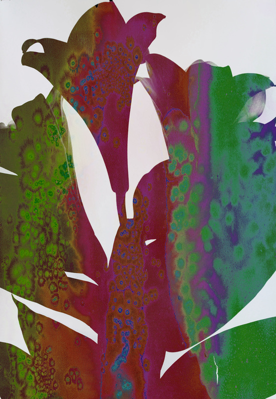
favourite images.


These are my favourite images from the project so far, I think that out of all the techniques I have used these images have turned out the best. All of the images show strong outlines and a range of techniques.
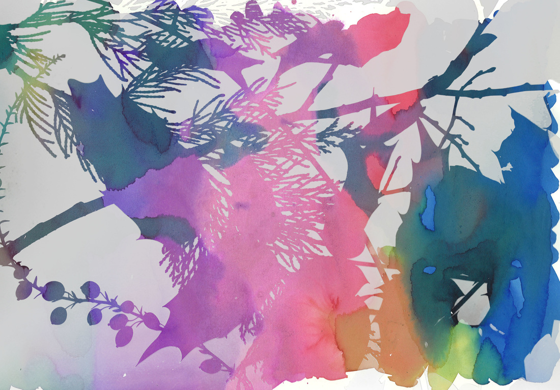
Final stages of development.
|
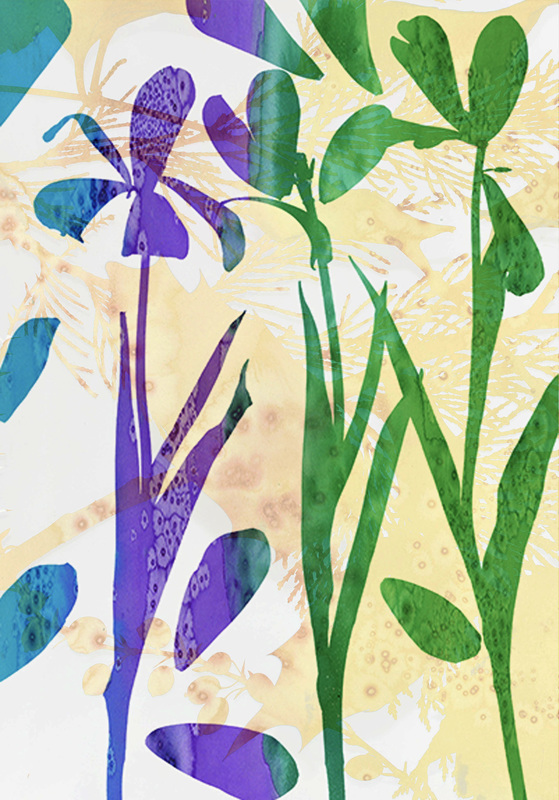
This image is one of my favourites from the outline project. I think that it fits the outline title really well. The image seems to be a combination of Bill Beckleys work with the flowers with the long stems and James Wellings work with the outline of flowers and colour behind it.
To finalise the image I firstly increased the vibrancy to make the background much brighter. I then used the lasso tool to individually select each of the stems shadows, I then decreased the brightness of the selected areas and then the contrast to make them darker creating more defined shadows. |
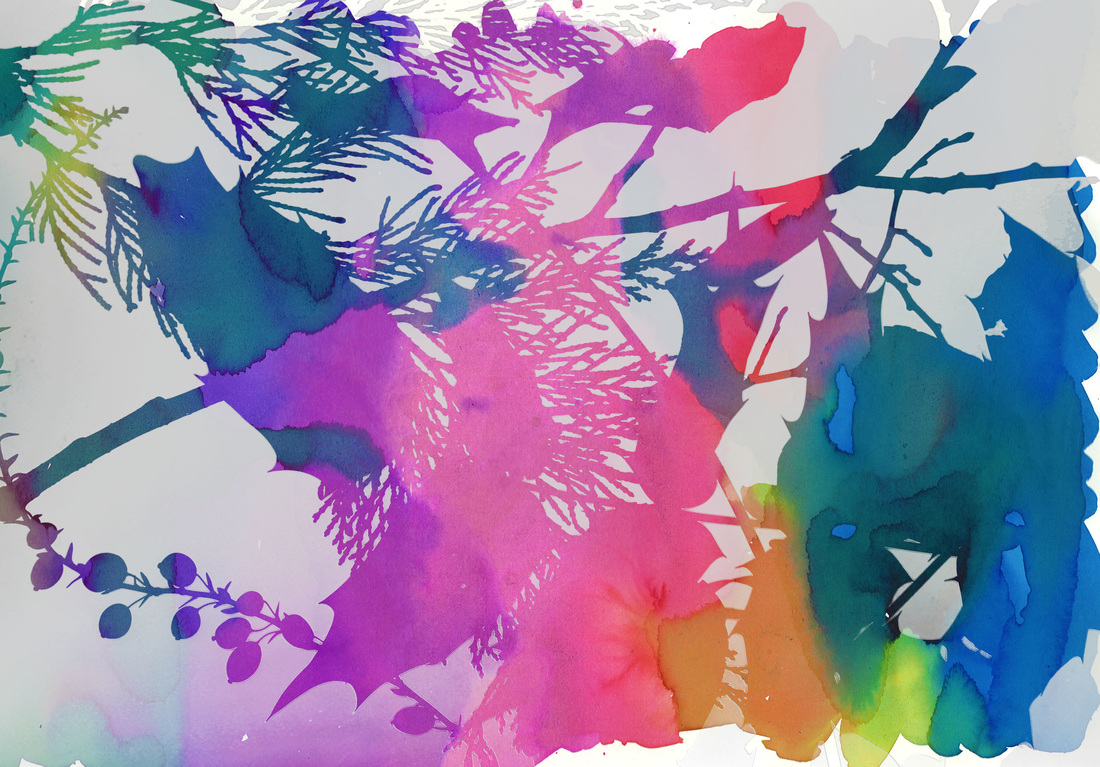
|
This is another favourite image of mine, I really like the combination of the colour and the solarised black and white. I think they really work well together, neither image overpowering the other. Both images have enough detail in them to work on their own but together I think it becomes a really powerful image without looking messy or overcrowded.
To complete the image completely I firstly increased the vibrancy which made the whole image brighter and made the detail of the solarised image really stand out. I then increased the saturation to make the colours of the flowers slightly brighter which helped to make the stems and the petals outline really defined. To finish off I adjusted the levels which made the solarised images outlines really defined, especially around the bottom left of the image. |
|
|
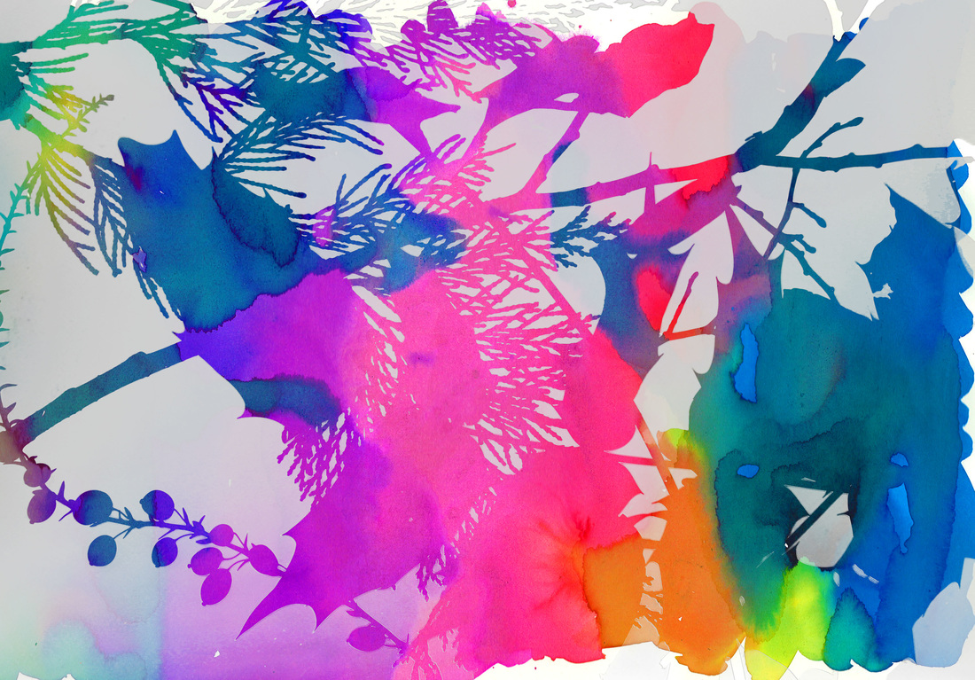
Another image I really like is this one because of the subtlety of the background and the brightness of the front image. This image really works with the idea of outline as the colours of the flower image really help to define the shape of the outline. Also the background image colours help with keeping the background subtle, the yellow/orange tones keep the focus on the purple/green/blue tones of the flowers without being distracting.
To develop this image to its best I firstly adjusted the levels which made the flowers colours slightly darker and more defined. I then increased the vibrancy to make the background stand out more along with the flowers. To finish I then adjusted the exposure to make both of the layers really defined. |
|
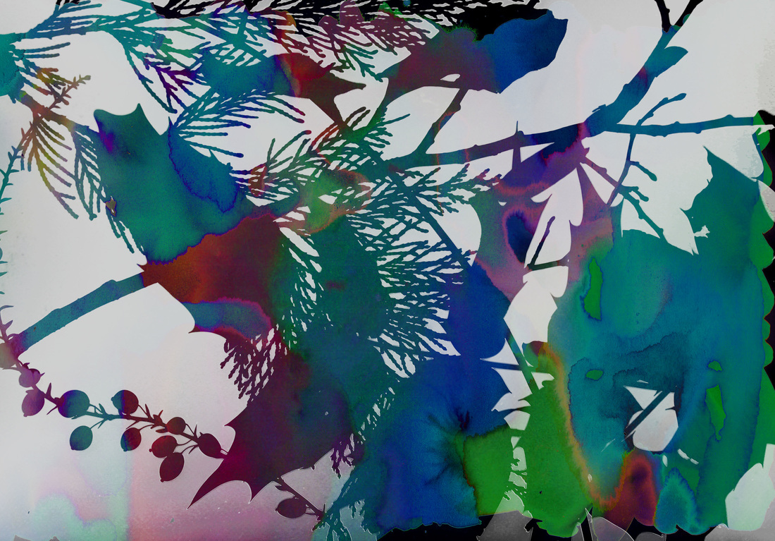
I really like the detail of this image, before I did the completion editing I had already solarised it which enhanced the detail of this image. I think this image works nicely with the title of outline because the shape of the petals are really defined.
To finish off this image I first increased the brightness and decreased the contrast which created a nice separation of the flowers from the leaves. I then adjusted the levels then the vibrancy which enhanced the detail of the lines on the petals face and the overall shape of the flowers. |
|
|
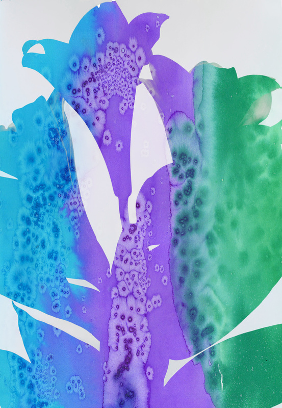
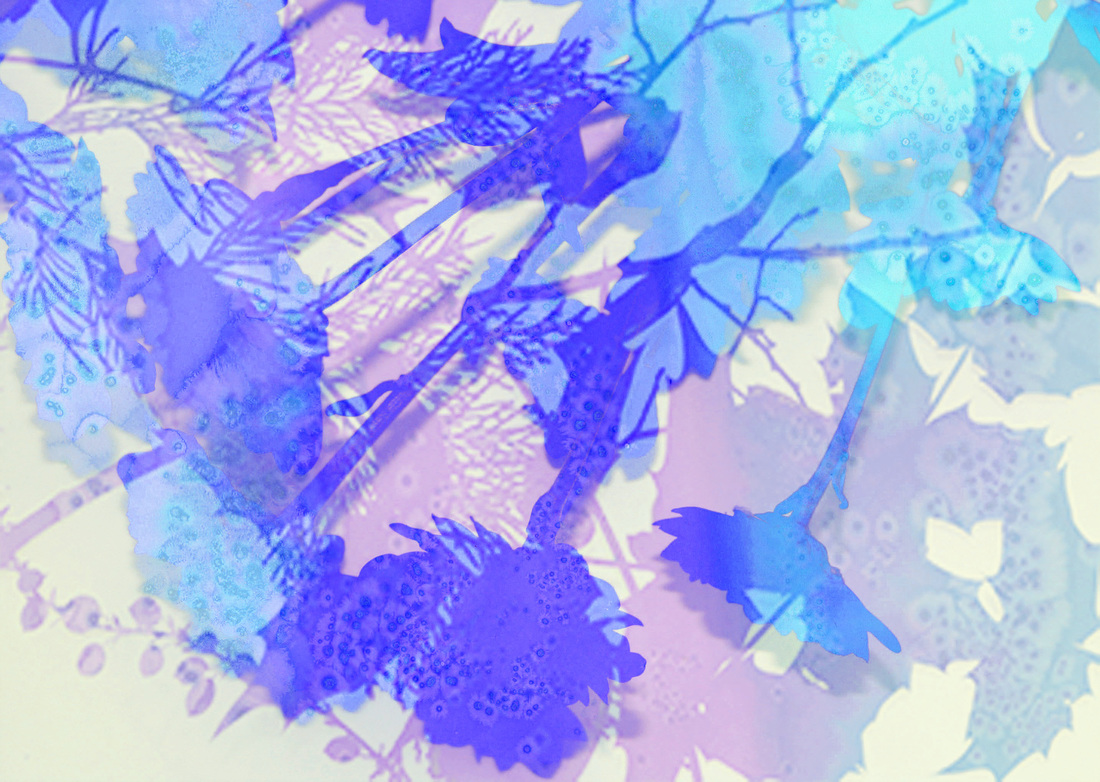
This is one of my favourite images from the project because of the was the colours work together. The image on top with the flowers really makes the light blues and the purples work well with the darker pinks/turquoise background colours.
To finalise this image I firstly used the lasso tool to select the visible shadows of the flower stems, I then decreased the brightness and contrast to make the stems more defined. Then over the whole image I increased the brightness to make the image lighter, then used the levels to make the darker colours slightly darker and defined. |
|
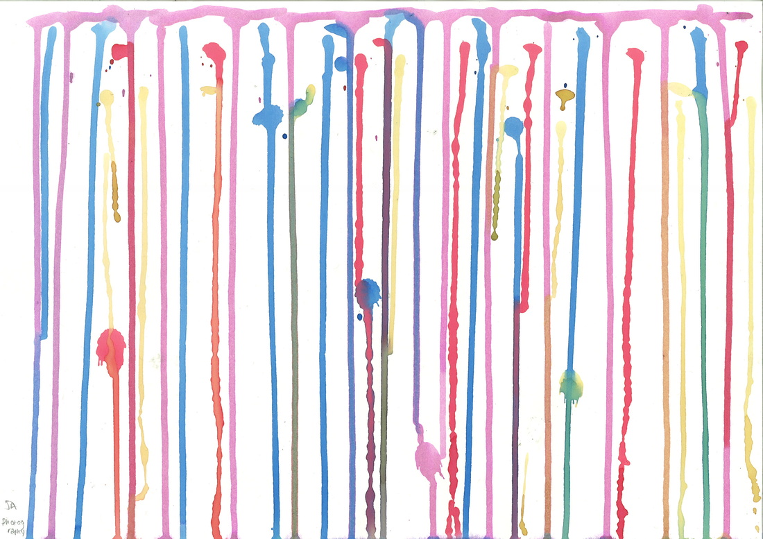
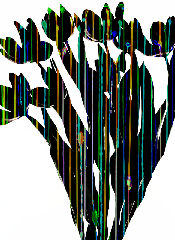
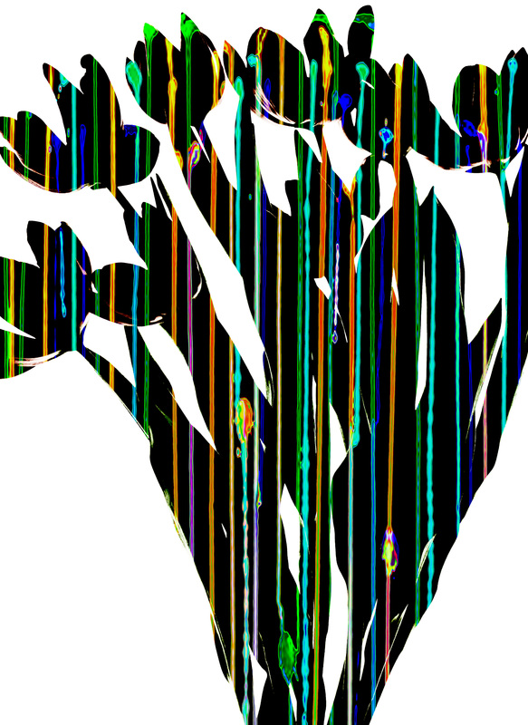
This image is one of the first from the whole outline project. I really like it, this style of image is a mix between Man Ray and Bill Beckley. The way the ink runs down the page looks really emphasizes the length of the stems as well as the shapes of the petals.
To edit this further I firstly increased the brightness and contrast to make the white background brighter and the black background darker. I then increased the vibrancy which made the streaks of ink look even more metallic and as if they are in UV light. To finish off I then adjusted the levels to really enhance the colour of the streaks. |
|
Final images.


